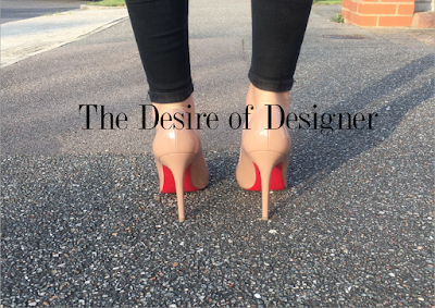
Advanced Portfolio Francesca Harrington 3181 Centre Number: 16607
7. An extract from an original documentary TV programme, lasting approximately five minutes, together with the following two options; a double-page spread from a listings magazine focused on the documentary, and a newspaper advertisement for the documentary.
Tuesday, 6 February 2018
Monday, 5 February 2018
Friday, 2 February 2018
Thursday, 1 February 2018
Wednesday, 31 January 2018
Monday, 29 January 2018
Sunday, 28 January 2018
EVALUATION: Question 4
Evaluation Question 4 - How did you use Media Technologies in the Construction & Research, Planning and Evaluation Stages?
Introduction
The use of media technologies was vital for each stage (construction, research, planning and evaluation) of my Advanced Portfolio. I had already started to use the majority of these technologies when creating my Foundation Portfolio, however my skills in the use of them have greatly developed since. I found the use of media and digital technologies to be most important in the production and distribution of my products, this is due to the ease and speed which the digital technologies allow. Whilst in the evaluation stage of my product they also had benefits, such as reaching a wider audience to receive feedback from. Finally the use of digital technologies in the research and planning section allowed ease of access and aided the organisation of my learning journey.
Research & Planning
*Blogger
The first media technology I used in my research and planning stage was Blogger, Blogger is an online blogging website where you can upload different posts onto one specific blog. I first used blogger in my Foundation portfolio, however my skills in the use of this have developed as I have now learnt how to embed videos and I also found more use out of embedding links into my posts.
For my advanced portfolio, Blogger has allowed me to seamlessly show my progress through my learning journey, starting with my research and planning then to my production and finally to my evaluation. It has enabled me to put all of my work into one place to create a timeline of my creative project, showing my developments, reflection and progression of ideas throughout.
Without this media technology it would have been much more difficult to document and organise my creative process, therefore showing how it was important to the planning and research of my project.
*Computers & the Internet
Another media technology which I have used through my planning and research section is computers and the internet. This technology is sometimes overlooked as it is so apparent, however I believe it was a vital part of my research and planning. The internet allowed me to research other fashion documentaries to find out what codes and conventions are used within them, this is important to my research section as otherwise I would have possibly missed out important conventions of what makes a fashion documentary.
The internet and computers have also allowed me to access websites such as Blogger, this allowing me to easily upload stages in my research and planning. The internet also allowed me to organise one of my interviews via email, making the planning of my documentary a lot easier and also a lot faster. Click here to see how I used Office365 email to contact one of my interviewees.
*Office365 Forms
Office365 forms is a program where you can create questionnaires to be answered by the people you send it out to. I used this program during my research as I contacted my focus group with a questionnaire (see here) to find out what they would like to see in a documentary. Once I received the results I used them to plan what type of documentary I was going to create. This showing how digital technology made it quick and simple to contact my focus group even if I couldn't contact them in person.
Production & Distribution
*Digital Camera & iPhone 6S
For the majority of my filming and photography I used an iPhone 6S, this digital technology is easily portable and can be taken anywhere. This was important for me as I had to travel to various locations around London to film my documentary, by having a small but high-tech piece of equipment I was able to record a wide range of shots at a very high quality. Using the iPhone also meant that I could take footage quickly and easily and also look back at the clips moments later, this piece of digital technology was very beneficial to the production of my product as it eliminated the difficulty of taking a very large film camera and sped up the process of production as I didn't need to wait for the film to develop.
I also chose to use a Canon camera to record some footage and also to take still images for my ancillary products. By using a high-tech camera it gave me very good quality images which made my product look professional.
It was very important that the quality of my footage and images were of the highest standard in order to create a professional looking product, this would also make my products more visually engaging maintaining the audience's interest.
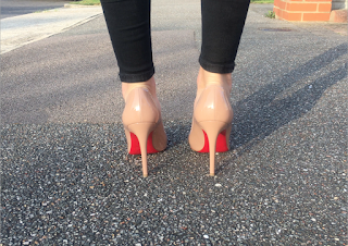 These images were shot using the Canon camera
I also chose to use a Canon camera to record some footage and also to take still images for my ancillary products. By using a high-tech camera it gave me very good quality images which made my product look professional.
It was very important that the quality of my footage and images were of the highest standard in order to create a professional looking product, this would also make my products more visually engaging maintaining the audience's interest.
 These images were shot using the Canon camera
*iPhoto
iPhoto was another media technology which was important during production, it allowed me to collate all of my images into one album where I could then share, upload and distribute my images and raw footage. This allowed me to send my photos to my target audience to see how they liked them or if they had any other ideas of images or footage to take, it also made it a very quick and easy process. See my contact sheet from iPhoto here.
*Adobe Photoshop
Photoshop was an important media technology for me to create my ancillary products, it was the main editing technology that I used for my Newspaper Advertisement/Poster. As there was minimal writing on this ancillary product I decided that Photoshop was the better Adobe program to use, the skills I learnt on Photoshop began when creating my foundation portfolio. I found at this stage in time I had minimal knowledge about using Photoshop, however through the use of YouTube tutorials and expert knowledge I improved on my skills which I then used for my advanced portfolio. I created a professional looking poster by experimenting with different layouts and tools which I had learnt how to use. See how I created my newspaper advertisement/poster here and here.
I also used Photoshop to edit the main image that I used on my double page spread to make it more aesthetically pleasing, I wanted to get rid of some imperfections in the image such as the line of a wardrobe down the middle and also a door handle at the left edge. You can see the before and after pictures of the image here.
*Adobe Indesign
Another media technology I used for the production of my ancillary product is Indesign, this is another Adobe program which is designed for the editing of pages that will have more text than images e.g. a magazine double page spread. After I had edited the main image of my double page spread using Photoshop, I used Indesign to put together the rest of the page, including the written article. This program allowed me to create a professional looking product, as I could use specialist effects such as 'dropshadows', as well as creating it efficiently. See the production of my double page spread using Indesign here and also here.
Another media technology I used for the production of my ancillary product is Indesign, this is another Adobe program which is designed for the editing of pages that will have more text than images e.g. a magazine double page spread. After I had edited the main image of my double page spread using Photoshop, I used Indesign to put together the rest of the page, including the written article. This program allowed me to create a professional looking product, as I could use specialist effects such as 'dropshadows', as well as creating it efficiently. See the production of my double page spread using Indesign here and also here.
*iMovie
iMovie is the main editing technology I used to create my documentary. Before creating my real documentary I wanted to play around with the effects and tools I could use, to do this I created a preliminary product where I recorded a girl receiving a phone call. It was very simple footage however, it allowed me to get used to iMovie and to learn different skills. You can see my preliminary product here.
I then was able to transfer these skills when creating my own product 'The Desire of Designer'. I imported all of my clips into the program and began to put them into an order adding transitions between clips to make them more fluid and smooth. As a began to do this I was able to understand where the direction of my documentary would go based on my storyboard. I used effects such a speeding up a clip - which I learnt from a YouTube video (see here) - and also adding in cutaways over another clip. I also wanted to test out different transitions between clips to see which worked best with my footage, see this here. iMovie allowed me to try all these different edits and to play around with what looked and worked best with my footage, therefore showing how important the use of media technology was in the production of my project.
Before media technology editing of film consisted of cutting celluloid film and putting different pieces back together, editing technology such as iMovie has immensely changed the editing of footage into a much faster and more advanced process. Something which I have greatly benefited from in this project.
*Blogger
I also used blogger during the production of my documentary and ancillary products. As all my previous decisions during planning were documented, I was able to look back when creating my own products to use inspiration from my research of pre-existing products to then implement on my own products. I was able to use my research of generic conventions in fashion documentaries and apply those conventions to my own product. (See these conventions here).
*Vimeo
Vimeo is a website where you can upload videos to share with an audience. I used this platform to upload my own documentary to share with my target audience, this allowing them to watch it and give me feedback on improvements I could make. It is a very easy platform to use and meant that I didn't need to send the video to each person individually as they could easily search for the video and it would come up. You can also see how I used Vimeo to embed the videos I created into blogger if you click here.
By using vimeo (in conjunction with iMovie) I have become a 'prosumer'. The idea of a 'prosumer' comes from David Gauntlett's prosumer theory, this theory suggests that due to the rise in technology the audience are becoming more able to participate in the production of media products. As I have created and shared my own media product I have therefore become a 'prosumer' where I am also contributing to the 'collective intelligence' on the world wide web.
Evaluation
*Questionnaires
When evaluating my products I needed to gain feedback from my target audience to effectively find out if it is successful for them. To do this I created multiple questionnaires at different points in the production to evaluate my progress so far. Digital technology aided me to collect this information with ease as emails allowed me to send out my questionnaire to a large amount of people at the click of a button. This helped me to gain fast replies and to also contact people that I wouldn't necessarily be able to contact in person, allowing me to get a more rounded evaluation. Thus showing that digital technology aided me in collecting results to evaluate my work. See two of my questionnaires here and here.
When evaluating my products I needed to gain feedback from my target audience to effectively find out if it is successful for them. To do this I created multiple questionnaires at different points in the production to evaluate my progress so far. Digital technology aided me to collect this information with ease as emails allowed me to send out my questionnaire to a large amount of people at the click of a button. This helped me to gain fast replies and to also contact people that I wouldn't necessarily be able to contact in person, allowing me to get a more rounded evaluation. Thus showing that digital technology aided me in collecting results to evaluate my work. See two of my questionnaires here and here.
*Office365 Forms
I found Office365 forms to be a very useful part of my evaluation. I used this program during my foundation portfolio, however to a much smaller scale than to what I have used it for my advanced portfolio. Office365 forms is a program where you can create questionnaires to be filled out by people you send it to. When evaluating the progress of my main product and ancillary products I created many questionnaires using this program to help me to see what stage my products were at and where they needed to improve. It allowed me to keep in contact with my target audience and to get feedback from them when I had updated my products. The results of the questionnaires were then collated by the program and put into pie charts (see below), this helped to simplify the results and highlighted strengths and weaknesses in the products. The feedback I had received from the questionnaires then influenced the improvements I made to my products. Office365 forms proved to aid my evaluation process by speeding it up and by getting more opinions to aid the improvement of my product.
I found Office365 forms to be a very useful part of my evaluation. I used this program during my foundation portfolio, however to a much smaller scale than to what I have used it for my advanced portfolio. Office365 forms is a program where you can create questionnaires to be filled out by people you send it to. When evaluating the progress of my main product and ancillary products I created many questionnaires using this program to help me to see what stage my products were at and where they needed to improve. It allowed me to keep in contact with my target audience and to get feedback from them when I had updated my products. The results of the questionnaires were then collated by the program and put into pie charts (see below), this helped to simplify the results and highlighted strengths and weaknesses in the products. The feedback I had received from the questionnaires then influenced the improvements I made to my products. Office365 forms proved to aid my evaluation process by speeding it up and by getting more opinions to aid the improvement of my product.
*Presenting evaluation questions (e.g.flipsnack, slidshare, prezi)
Media technology also proved useful when presenting my evaluation questions, I used various websites including 'flipsnack', 'slideshare' and 'prezi' (see below). These websites each present information in different aesthetically pleasing and engaging ways. I found these websites very useful as I was also able to portray the aesthetic of my products through the evaluation questions for them, this also continued the brand identity of my project.
Conclusion
After looking back at my project, I have concluded that it would be nearly impossible to complete my products to such a high standard without the use of media and digital technology. During this project I was introduced to new technologies such as iMovie where I was able to expand and develop new skills which I didn't have when creating my foundation portfolio. I also found that it would be a much slower and longer process when evaluating my products without the use of media technology. Thus highlighting the immense importance of media and digital technology when undertaking this project.
Media technology also proved useful when presenting my evaluation questions, I used various websites including 'flipsnack', 'slideshare' and 'prezi' (see below). These websites each present information in different aesthetically pleasing and engaging ways. I found these websites very useful as I was also able to portray the aesthetic of my products through the evaluation questions for them, this also continued the brand identity of my project.
 |
| Flipsnack I created, link here |
 |
| Prezi I created, link here |
 |
| Slideshare I cretaed, link here |
Conclusion
After looking back at my project, I have concluded that it would be nearly impossible to complete my products to such a high standard without the use of media and digital technology. During this project I was introduced to new technologies such as iMovie where I was able to expand and develop new skills which I didn't have when creating my foundation portfolio. I also found that it would be a much slower and longer process when evaluating my products without the use of media technology. Thus highlighting the immense importance of media and digital technology when undertaking this project.
Wednesday, 24 January 2018
Tuesday, 23 January 2018
POST-PRODUCTION: Textual Analysis of my Newspaper Advertisement/ Poster
Script for my Textual Analysis:
*The main image of the poster
consists of a girl standing in designer shoes, this image links the
advertisement to the genre and also to the narrative of the documentary. This creates a house style and also a brand
identity between the three products.
*The colour scheme of black and red
is continued onto this page, this makes the products identifiable to each other
and furthermore creates a brand identity. By using the colour scheme across the
whole page it ensures there is a continuity and consistency, this also makes
the product aesthetically pleasing.
*The main title of the documentary
has been placed in the centre of the poster, this conforms to generic conventions
of newspaper advertisements. The ‘D’s’ in desire and designer have also been
put in red, this is the same as on the TV listings double page spread creating
a continuity between the products.
*The air date and time has been
place underneath the main title, this anchors the page and entices the audience
to watch the documentary on its air date.
*A social media hashtag has been
placed in the bottom left corner of the poster, this is subtle however it
entices the audience to participate in the documentary via social media. This
will result in the documentary reaching a wider audience.
*Finally, the logo for the channel
which the documentary has been placed in the top left corner. This gives the
page an identity and makes it identifiable to that TV channel.
Monday, 22 January 2018
Friday, 19 January 2018
PRODUCTION: Ancillary Product - TV Listings Double Page Spread Final Draft; Audience Feedback
Once I had acted on my previous feedback and improved my double page spread I went back to my target audience to make sure there were no other adjustments or improvements that they thought I could make. You can see below the questions I asked:
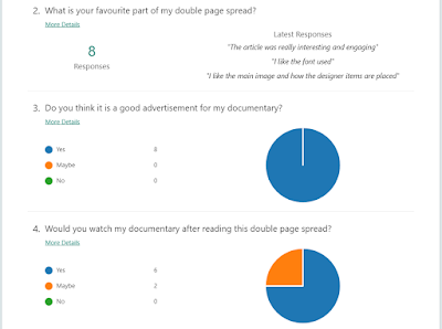
You can now see below the responses I got:
After receiving this feedback I found that there were no more improvements to make to my double page spread and that my target audience really liked the end product. Therefore meaning it is successful within my target audience.
Thursday, 18 January 2018
Thursday, 11 January 2018
RESEARCH: Ancillary Product - TV Listings Double Page Spread 1st Draft; Audience Feedback
For my audience feedback for the 1st draft of my TV listings double page spread I went back to my focus group to ask them for a comment each on what they thought was good and what they thought I could improve on. Here is what they said:
"I really like the black and red colour scheme, it matches really well with the main image. One thing you could improve on is by adding smaller images which are relevant and used in your actual documentary to make the page more interesting." - Connie Davies
"I love the main image you have used! It really portrays what your documentary is focused on, one thing you could add is some social media accounts so that the viewers could look into more information about the documentary" -Imogen Painter
"It all looks amazing! It really suits your documentary genre and is clearly linked to the themes within the documentary" - Lydia Cassettari
"The layout looks really neat and concise. One thing you could add is the listings of when the documentary will be shown rather than just the air date, you could also add the BBC Iplayer logo if it will go onto there after being aired" - Storm Baron
Tuesday, 9 January 2018
Saturday, 6 January 2018
PRODUCTION: Audience Feedback on Final Draft
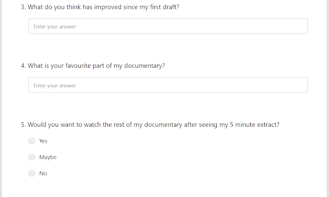
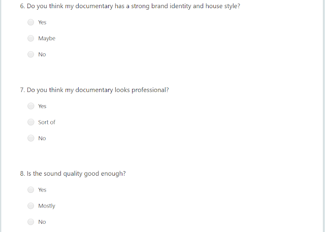
After finishing the final draft of my documentary I wanted to receive final audience feedback to ensure I had met the needs of my target audience. Below you can see the final questions I asked:
Below you can now see the 20 responses I gained from my questionnaire:
From this feedback I found that my documentary had really improved since my first draft, it meets the needs of my target audience much more directly now and the documentary also looks a lot more professional. One of the main things that has improved my documentary is the extra interview with a person with an 'indie' fashion sense.
Friday, 5 January 2018
Thursday, 4 January 2018
PRODUCTION: Ancillary Product - TV Listings Double Page Spread; Photoshopping
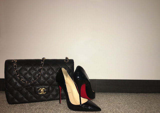
I firstly took this image to use for my TV Listings double page spread, however I found the centre line and the door handle at the far left edge of the page gave it an unprofessional look. I decided to edit out these flaws using photoshop to create a seamless and more professional image. See the result below:
Friday, 29 December 2017
RESEARCH: Audience Feedback on 2nd Draft
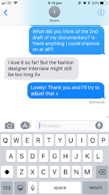
After the 2nd draft of my documentary I wanted to again gain feedback from my audience. I used two of the individuals from my focus group to watch and give feedback on the updated version of my documentary. Above you can see what they said.
Thursday, 28 December 2017
Tuesday, 19 December 2017
RESEARCH: Ancillary Product - Newspaper Advertisement/Poster; Audience Feedback
For the final draft of my newspaper advertisement I wanted to get some more audience feedback to ensure that it has met all the needs and standards of my target audience. To do this I created a short questionnaire for a group of individuals to answer to confirm I have created a product of interest to them. You can see the questions I asked below:
You can now see the responses I got from the questions:
By getting this piece of audience feedback I was able to confirm that my product would be successful within my target audience and that there are no more adjustments which needs to be made.
Tuesday, 12 December 2017
Monday, 4 December 2017
RESEARCH: Ancillary Product - Newspaper Advertisement/Poster 1st Draft; Audience Feedbak
Above you can see the comments I received on my first draft of my Newspaper Advertisement/Poster. From these suggestions I have decided to add in a social media #, add the logo of the channel it is on and change the 'D's' of 'Desire' and 'Designer' to red.
Friday, 1 December 2017
PRODUCTION: Ancillary Product - Newspaper Advertisement/Poster 1st Draft
This is the image I chose to use for the background of my poster, this is because it is a still from a moving image in my documentary. This will clearly link the poster to my documentary creating a continuous house style.
I then added the title of my documentary to the image. I used the same font used in my documentary to again contuse the house style.
I then added more specific details of when the documentary was going to be aired to conform the the conventions of a documentary poster.
Subscribe to:
Comments (Atom)
-
For one of my ancillary products I need to create a double page spread of a listings magazine, to do this I wanted to research into the gene...
-
I wanted to speed up a specific clip in iMovie however I was unsure on how to do this. I looked up a video on YouTube which gave me the rig...
-
I wanted to add the next scene of my documentary into my iMovie but with different background music with it. I was struggling to do this be...


